Visualizing
Find out more about the basics, what types of graphs and diagrams there are, about the tools and mind-blowing data visualization.
On this site:
Basic Visual Grammar
A number of features need to be considered carefully before and while visualizing your data.
To get an impression of what this is all about, take a look at the information provided by Beutler Ink. These are presentation-slides created using Power Point.
Also head over to YouTube and check out their presentation about Data Visualization for Non-Programmers.
| Color, Size, Shape, Proximity Choose those above mentioned features carefully in order to differentiate information from the background or other. Make sure the techniques work with the presentation tool or printing method you’re using. | Economy Prioritize your data. Focus on the data which aids transporting the message. Don’t include visual distractions from the main points you want to get across. |
| Abstraction Every and any graphic or chart or visualization of data is an abstraction from the real world. Clarify what your abstraction refers to. | Emphasis Make sure your graphic/visualization transports the crucial and main information, and is not a visual overload of information. |
Graphs, Charts, Tables and More
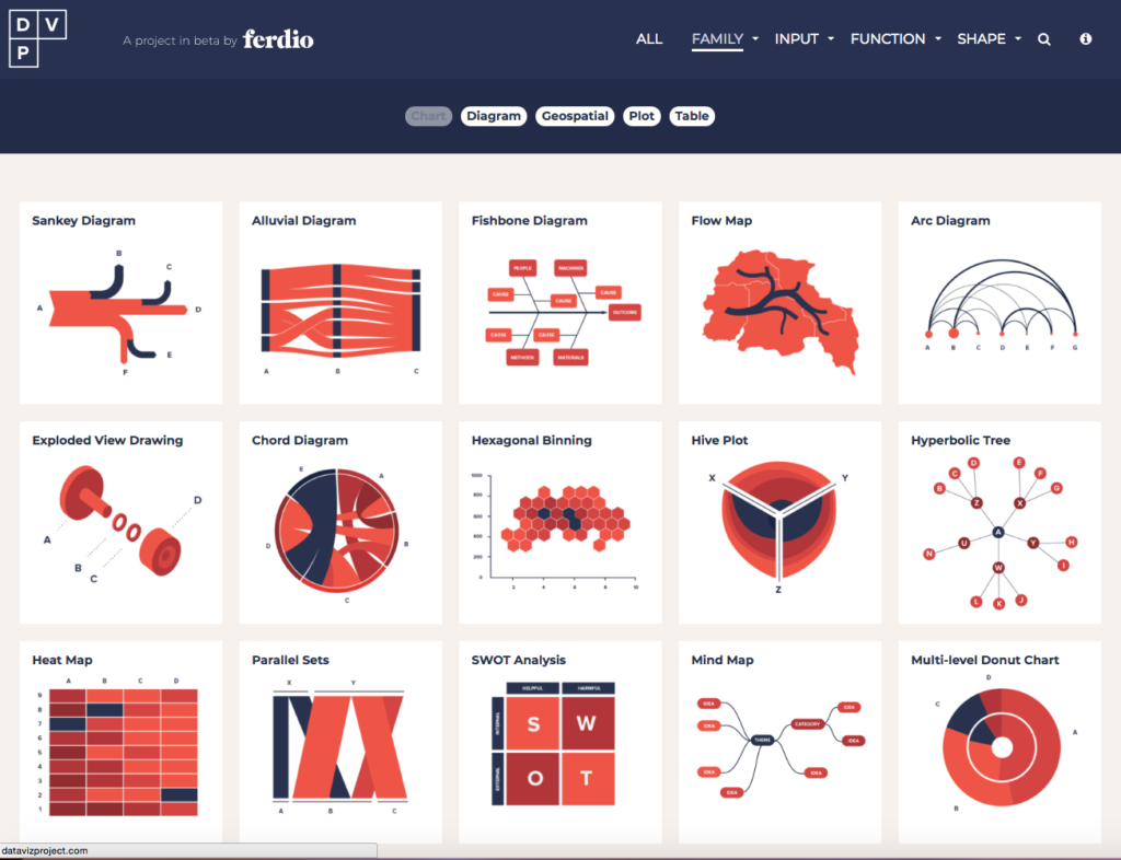
The Datavizprojekt gives you an extensive list of types of diagrams, grouped by type (e.g.: chart, diagram, geospatial, plot, table), sorted according to the type of input you can provide and the function it fulfils (e.g.: comparison, concept visualization, correlation, distribution, geographical data, part to whole, trend over time).
This project is a great way to get a first impression at a glance what kind of visualization goes well with the set of data you have.
Tools
There are various platforms, programs and tools to visualize your data. Tools can be grouped into desktop clients or web-based apps. Furthermore, you can either use them for free of charge, pay a monthly fee for an upgraded version or register for a proper license with various kinds of fees (e.g.: monthly fee, one-time payment, etc).
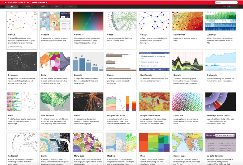
A list of visualization tools can be found under: http://selection.datavisualization.ch/.
Computerworld provides a list of “22 free tools for data visualization and analysis”. Always worth checking out.
Another great tool, unfortunately it comes at a certain cost – Adobe Illustrator.
Presentation-Tools that come at low cost:
You can also produce high quality visualizations with Microsoft Power Point.
Create infographics rather easily with Infogram or Piktochart.
Data Vis at ISTA
ISTA provides a list featuring softwares used for data visualization:
Click here for Software Scientific Publishing.
Mind-blowing Data Visualization
Get some inspirational input and browse through some of the amazing visualizations below.
“Tableau Public Feed“
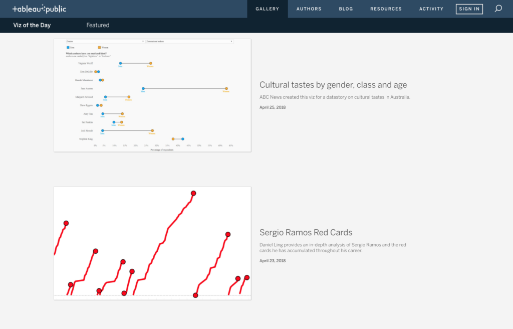
Stunning data visualization examples from across the web created with Tableau Public.
“A Collection of 10 Data Visualizations You Must See“
by Analytics Vidhya
This site shows a number of visualizations, provides the source code or original research article and also lists the tools that were used creating the visualization.

This surreal visualization “shows 800 runs of a bicycle being pushed to the right. For each run, the path of the front wheel is shown until the bicycle fell over.” The research paper is written in a humorous tone as well, adding to the already fascinating effort of creating self-riding bicycles.
“16 Captivating Data Visualization Examples“
by HubSpot/Ross Crooks
This entry presents a number of visualizations, animated or not, and touches upon several topics, also related to Austria. Pretty interesting!
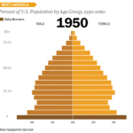
This is a strong example of how to present a single data set in a compelling way. Pew Research created this animated GIF composite to show shifts in population demographics over time. It’s a great way to tell a larger story in a neat package.
Plus, this type of micro-content is easy to share on social or embed in blogs, extending the content’s reach. If you want to make a GIF of your own using Photoshop, here’s a step-by-step tutorial.
“50 Great Examples of Data Visualization“
by WDD Staff
This page shows a wide variety of visualizations and provides a brief description and discussion of the tools that were being used.

The image above shows the hierarchical structure of the Internet, based on the connections between individual nodes (such as service providers). Three distinct regions are apparent: an inner core of highly connected nodes, an outer periphery of isolated networks, and a mantle-like mass of peer-connected nodes. The bigger the node, the more connections it has. Those nodes that are closest to the center are connected to more well-connected nodes than are those on the periphery. It shows how the central core of the Internet is made up of about 80 core nodes, but that even if those nodes failed, 70% of the other nodes would still function via peer-to-peer connections (accessed April 23rd, 2018 via https://www.technologyreview.com/s/408104/mapping-the-internet/).
Information and Inspiration
- For additional information, the Homepage of the Duke University also offers a great range of information (regarding tools, tutorials, examples, etc.) about data visualization.
- Blog Data Wrapper – “The mission of this blog is to teach you how to better visualize data.”
- Tutorials from FlowingData – “Learn to visualize your data like an expert with these practical how-tos for presentation, analysis, and understanding.”